
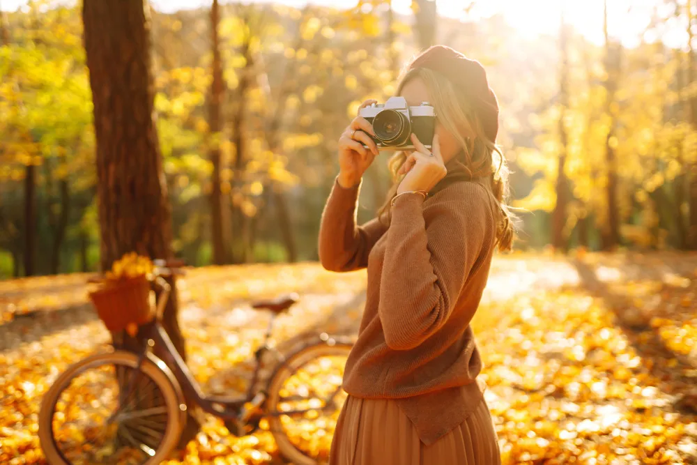
Every autumn, the same thing happens. You step outside, the light is doing something ridiculous through the trees, the leaves look like they were painted by someone with a very limited but very good palette, and you pull out your phone to capture it. Then you look at the photo and it is flat, slightly blue, and somehow makes a maple tree look like a parking lot. The gap between what you saw and what your phone recorded is not a hardware problem. It is a timing, framing, and editing problem, and all three are fixable in an afternoon.
This guide walks through the whole process in plain language: when to go out, how to aim the camera, which two taps make the biggest difference, what the editing sliders actually do, and how to keep your photos from sliding into that oversaturated orange look that everyone recognizes and nobody admits to liking. If you have been chasing the fall aesthetic on your feed and wondering why your own shots never match it, the answer is rarely the phone. You need a charged battery, about ninety minutes of the right light, and a little restraint.
Timing: The Ninety Minutes That Do Most of the Work
Autumn light is warm on its own because the sun sits lower in the sky for more of the day. Your job is to show up when that warmth peaks. Golden hour is the stretch that starts roughly forty-five minutes before sunset and runs until about fifteen minutes after the sun disappears. In most of the United States in October, that means heading out between four and five in the afternoon and staying until it is genuinely getting dark. The morning version, from about fifteen minutes before sunrise to an hour after, is just as good and usually far less crowded, with the bonus of mist over grass and water on cool mornings.
Check the sunset time for your exact location the day before, then arrive twenty minutes early. Warm light shifts fast, and the last ten minutes before the sun drops below the horizon are often the richest. Do not pack up the moment the sun sets. The twenty minutes after, sometimes called blue hour, gives you soft pink and lavender skies that make orange and red leaves look almost lit from within.
Two situations to avoid: midday sun, which flattens color and throws harsh shadows across faces and foliage, and completely gray overcast skies with no texture, which drain warmth entirely. That said, a bright overcast day right after rain is a hidden gem. Wet leaves, wet pavement, and diffused light give you saturated color without any editing at all.
Composition: Where to Put the Leaves
The easiest upgrade is to stop centering everything. Turn on your camera grid in settings, then place your main subject, whether a tree, a person, or a coffee cup on a bench, along one of the lines or at one of the four intersections. It takes one second and instantly makes a photo feel intentional rather than accidental.
Next, think in layers. A strong autumn photo usually has three: something close in the foreground, the subject in the middle, and depth in the background. A few leaves on the ground at the bottom of the frame, a path or a person in the middle, and trees fading into haze behind. If your shot feels boring, the fix is often as simple as crouching so a patch of leaves or a low branch enters the bottom or top edge of the frame.
Look for lines that pull the eye inward: a sidewalk, a row of trees, a fence, a creek. Stand so the line starts near a corner of your frame and runs toward your subject. And shoot low far more often than feels natural. Kneeling puts fallen leaves in the foreground and makes even a small tree look like a canopy. Most people shoot everything from standing eye level, which is exactly why most autumn photos look the same.
Finally, backlight the leaves when you can. Position yourself so the low sun is behind the foliage, shining through it toward you. Leaves become translucent and glow like stained glass. You will need the exposure trick in the next section to make this work, because your phone will otherwise panic and turn everything into silhouettes.
The Two Taps That Fix Almost Everything
Your phone’s camera guesses what you want exposed correctly. In autumn, it guesses wrong constantly because bright skies and dark tree trunks confuse it. Take control with exposure lock. On most phones, tap the part of the scene you care about, then press and hold on that spot for a second or two until a lock indicator appears. Now the focus and brightness stay fixed while you recompose. Tap once anywhere to release it.
Once locked, look for the small sun icon or brightness slider that appears next to the focus box. Drag it down slightly, about one notch or a quarter of the way, so the photo looks a touch darker than you think it should. Slightly underexposed autumn photos keep their color; overexposed ones lose the reds and golds to washed-out white, and no editing brings that back. You can always brighten shadows later. You cannot recover a blown-out sky.
For backlit leaves specifically, tap on the brightest glowing leaf, lock, and let the surroundings go a bit dark. The result is a moody, warm image with the light exactly where you want it. If you want a person in the frame too, tap on their face instead and accept that the background will go brighter and softer. Pick one thing to be perfect.
Two more settings worth changing before you head out: turn on the highest quality photo format your phone offers, and turn off any automatic beauty or scene enhancement filters. Those filters make decisions you cannot undo, and they tend to push warm scenes into cartoon territory. You want the flattest, most honest starting point so your own edits have room to work.
Editing Sliders, Translated Into Plain English
Every phone’s built-in photo editor has roughly the same dozen sliders. Here is what each one actually does to an autumn photo, in the order that works best. Do them in this sequence and keep every adjustment small. A good rule: if you notice the edit, you went too far.
- Exposure or Brightness: the whole image gets lighter or darker. Adjust first, gently, and only if the shot is clearly too dark or too bright overall.
- Shadows: lifts only the dark areas. This is your rescue slider for the darkened tree trunks and faces from that slightly underexposed shot. Push it up moderately, but stop before shadows turn gray and murky.
- Highlights: pulls back only the bright areas. Drag it down to recover detail in a pale sky or a sunlit patch of leaves.
- Contrast: makes darks darker and lights lighter at once. A little adds punch. A lot makes leaves look crunchy and fake. Small nudge only.
- Warmth or Temperature: shifts the entire image toward yellow-orange or toward blue. Move it toward warm slightly, then stop. The next section explains why this is the most dangerous slider on the list.
- Tint: shifts between green and magenta. If your foliage looks a little sickly or too neon green in the shadows, a nudge toward magenta fixes it. Otherwise leave it alone.
- Saturation: intensifies every color equally. Autumn photos rarely need more of this. If anything, pull it down a hair.
- Vibrance: intensifies only the muted colors while protecting the already-bright ones and skin tones. This is the slider you want instead of saturation. A moderate boost here makes browns and muted golds sing without turning red leaves radioactive.
- Sharpness or Definition: adds crispness to edges. Barely touch it. Over-sharpened leaves develop weird halos.
- Vignette: darkens the corners. A subtle one focuses attention toward the center and adds a cozy feeling. Keep it light enough that nobody could name it.
Do the whole pass in under two minutes, then step away from the phone for a bit and look at the photo fresh. Fresh eyes catch the overcooked edit that tired eyes approved. If you are editing a batch from the same outing, edit one photo carefully, then copy those adjustments to the rest so the set looks consistent.
Avoiding Orange Overkill
The single most common autumn editing mistake is treating warmth like a volume knob and turning it all the way up. The result is that unmistakable look where the sky is peach, the sidewalk is peach, the dog is peach, and the leaves have become one flat block of the same peach. Real autumn has range: cool blue-gray sky, brown bark, deep green pines that have not turned, gray stone, and warm leaves against all of it. The contrast between the warm and the cool is what makes the warm look warm.
A practical test: after editing, find something in the photo that should be neutral, such as white clouds, a gray path, a white shirt, or a silver railing. If it has turned yellow or orange, back the warmth slider down until it reads as neutral again. Then, if you still want more autumn glow, use vibrance instead, which will lift the leaves without staining the neutrals.
Skin is the other tell. If you are photographing people, their faces should look like faces, not like they have been dipped in caramel. Zoom in on a cheek before saving. If it looks too orange, reduce warmth by a notch, or if your editor allows it, reduce saturation on just the orange channel a little. That one move is often the difference between a photo that looks professional and one that looks like a filter.
The fall aesthetic works because it is built on texture and softness, not on one color cranked to maximum. Think of the warmth as the last five percent of the edit, not the first fifty. Aim for a photo taken on a mild October afternoon rather than one taken on the surface of the sun.
Subjects Worth Shooting Beyond the Obvious Tree
Trees are lovely, but a whole camera roll of trees gets old by the second week. Widen the list: a single leaf on wet pavement shot from directly above with the phone about a foot away; steam rising from a mug held toward the low sun; hands in knit sleeves holding something small; a rain-streaked window with warm lights inside, shot from outside at dusk; boots on a gravel path; reflections in puddles, which double your color for free and look best when you crouch until the phone nearly touches the ground.
Try shooting the same spot three times over a few weeks. Early fall gives you green with hints of gold, peak fall gives you full color, and late fall gives you bare branches with a carpet below. Side by side, the three tell a story a single shot never could.
Organizing So You Can Actually Find the Good Ones
Shooting a lot is the right approach. Keeping all of it is not. The evening of an outing, before the glow fades, do a first pass: flag or favorite the ten to fifteen you actually like and delete obvious duplicates, blurry frames, and the one where a stranger walked through. Waiting a week means you never do it.
Create one album per season and year, named simply so future you can find it. Inside it, keep only the edited keepers. Back the album up to whatever cloud storage your phone already uses so a cracked screen in November does not erase October. If you shot a lot of one scene, keep the single best version and let the rest go. Two hundred near-identical photos of the same tree are not a collection; they are a chore you have assigned to yourself later.
Once your keepers are organized, they stop being just photos and start being useful. Warm autumn shots make excellent phone wallpapers, and the team at WellnessZing put together a broader guide on building a whole fall aesthetic mood at home, from wallpapers and cozy drinks to candles and layers, if you want to carry the feeling beyond the camera roll. A printed set of five or six of your favorites, swapped into frames you already own, also does more for a room than most store-bought decor.
A Simple Plan for Your First Outing
Compressed into a checklist: check tonight’s sunset time and set a reminder for an hour before. Charge your phone and clear some space. Turn on the grid, switch to the highest quality format, turn off automatic filters. Arrive twenty minutes before golden hour and walk until you find backlit leaves. Tap, hold to lock, nudge brightness down a notch, shoot from lower than feels normal, and stay through blue hour. That night, favorite your best fifteen, edit one carefully with shadows, highlights, a whisper of warmth, and vibrance rather than saturation, then copy that edit to the rest. Check a neutral object and a face for orange. Make an album, back it up, and pick one for your lock screen.
None of this requires talent. It requires showing up at the right hour and resisting the urge to move any slider past halfway. The fall aesthetic, done well, is just the real world caught at its warmest and edited with a light hand. Go stand under a tree at a quarter to five and prove it.
