
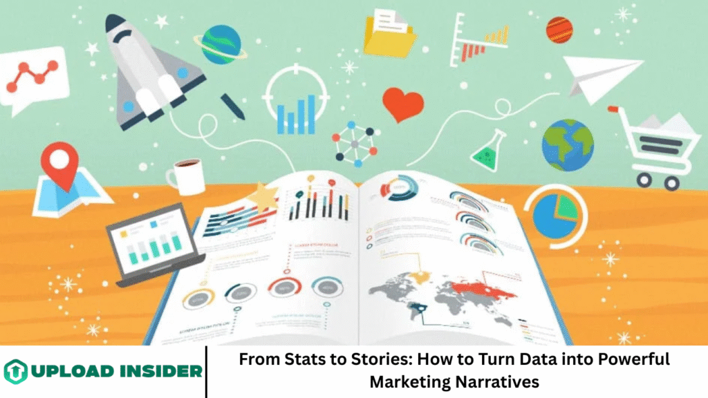
We live in a world that runs on data. Every click, scroll, share, and purchase generates information. Marketers have access to more data than ever before—analytics dashboards, customer behavior reports, sales trends, and social media insights. But while data can inform, it doesn’t inspire—until it’s turned into a story.
Storytelling gives numbers meaning. It gives your audience a reason to care. When done right, it transforms dry stats into emotionally engaging, action-driving narratives that make your brand stand out.
In this article, we’ll dive into how to effectively turn raw data into compelling marketing stories. You’ll learn practical techniques, inspiring examples, and storytelling frameworks to help you resonate with your audience—whether you’re pitching to a CEO, writing a blog post, or creating a viral campaign.
More Read: 5 Powerful Ways to Emotionally Hook Readers from Page One
Why Storytelling with Data Matters
Data storytelling sits at the intersection of analysis, narrative, and visual communication. It’s the key to turning metrics into marketing gold.
It Humanizes the Numbers
Stats alone can be cold and impersonal. But when you tell the story behind those numbers—customer struggles, triumphs, or trends—you humanize your message.
It Increases Retention and Engagement
According to cognitive research, stories are 22 times more memorable than facts alone. By wrapping your data in narrative, you boost recall, interest, and shareability.
It Builds Trust and Transparency
Transparent storytelling backed by data builds credibility. Audiences appreciate honesty, especially when supported by real evidence.
It Drives Action
Emotion drives action, not just logic. Stories rooted in data activate empathy, urgency, and connection—leading to clicks, sign-ups, purchases, and loyalty.
The 3 Key Elements of Data Storytelling
To tell a compelling data-driven story, you need to combine three essential elements:
Data (What happened?)
This is your foundation. It might be numbers from a survey, website analytics, or customer feedback. It should be accurate, relevant, and meaningful.
Narrative (Why does it matter?)
This is where you connect the dots. You weave a beginning, middle, and end. You introduce conflict, discovery, or transformation.
Visuals (How do we see it?)
Data visualization—charts, infographics, maps, or videos—brings clarity and emotion. A well-designed visual can make insights pop instantly.
Step-by-Step: How to Turn Data into a Story
Let’s break it down.
Define Your Objective
Ask: Why am I telling this story?
Are you trying to boost conversions? Build brand trust? Advocate a new product feature? Your objective shapes everything else.
Know Your Audience
Different audiences care about different aspects of the data. A CMO may want ROI numbers, while a customer wants proof your product works. Customize your message to fit their worldview.
Explore and Analyze Your Data
Dig deep. Look for:
- Trends: Are numbers rising or falling?
- Anomalies: Any unexpected spikes or drops?
- Comparisons: How does this compare to past data or industry benchmarks?
- Patterns: Are there hidden stories in demographics, geography, or behaviors?
Tools like Google Analytics, Tableau, Excel, or customer insight platforms can help uncover meaningful patterns.
Find the Emotional Core
Ask: What’s the human story here?
For example:
- Did 85% of users abandon the sign-up process? That’s frustration.
- Did your tool save a customer 20 hours a week? That’s relief and success.
- Did mobile traffic grow 150%? That’s an opportunity—or a warning.
- Emotion is the bridge between your data and your audience.
Create a Clear Narrative Arc
Use a structure. The Hero’s Journey or Problem-Solution-Outcome format works well:
- Problem: Introduce the challenge or context.
- Solution: Present your intervention or insight.
- Outcome: Show results with supporting data.
Example:
“When our client saw a 40% drop in email opens, we analyzed subject line performance. By A/B testing new formats, they increased engagement by 65% within a month.”
Use Visuals to Amplify Impact
Good data visualization:
- Clarifies—not confuses
- Highlights the key takeaway
- Avoids clutter and exaggeration
Use:
- Bar charts for comparisons
- Line graphs for trends
- Pie charts for proportions
- Heat maps for geographical data
Always label clearly, use brand colors sparingly, and ensure accessibility (e.g., colorblind-friendly palettes).
End with a Call to Action
What should the reader do with this insight?
- Try a demo
- Share the post
- Download a whitepaper
- Rethink a strategy
Don’t leave your audience with just “hmm.” Give them a path forward.
Real-World Examples of Data-Driven Storytelling
Spotify Wrapped
Each year, Spotify tells each user the story of their year in music. It’s highly personalized, visual, emotional—and shareable.
Why it works:
- Uses personal listening data
- Celebrates user identity
- Makes data feel like a gift
The New York Times: “How the Virus Got Out”
This COVID-19 feature combined maps, data, and narrative to explain virus spread.
Why it works:
- Uses animation and visuals
- Tells a chronological story
- Engages emotionally through global implications
Airbnb’s Annual Report
Airbnb uses data to highlight social impact, economic benefits, and host stories.
Why it works:
- Combines data with real human stories
- Reinforces brand values
- Builds trust with stakeholders
Tips to Master the Craft
✅ Be Selective with Stats
Too many numbers overwhelm. Choose only what supports your narrative.
✅ Show, Don’t Just Tell
Instead of saying “we improved,” show the before and after visually.
✅ Avoid Jargon
Speak in plain language. Make your story accessible to all readers.
✅ Test and Iterate
Run A/B tests on storytelling formats. See what resonates most with your audience.
✅ Use Tools to Enhance Visual Storytelling
Consider using tools like:
- Canva or Visme for infographics
- Datawrapper for interactive charts
- Google Looker Studio for dashboards
- Figma for custom designs
Frequently Asked Question
What is data storytelling in marketing?
Data storytelling is the practice of combining data analysis with narrative and visuals to communicate insights in an engaging and persuasive way. In marketing, it’s used to make reports, case studies, or campaigns more compelling.
Why is storytelling important when using data?
Storytelling adds emotional and contextual value to raw data. While data provides proof, stories provide meaning. This helps brands connect with their audience on a deeper level and inspire action.
How can I find stories in my marketing data?
Look for unusual trends, spikes, drops, or patterns. Ask: what changed, why, and who was affected? Then frame the insights using common storytelling arcs such as problem-solution-outcome.
What tools can help with data storytelling?
Some popular tools include:
- Google Analytics (data source)
- Looker Studio (dashboard storytelling)
- Canva / Visme (infographics)
- Tableau / Power BI (data exploration and visualization)
- Datawrapper (charts and maps)
How do I make sure my data storytelling is ethical?
Always ensure data accuracy, use transparent methods, and avoid manipulating visuals or cherry-picking stats. Clearly cite sources and maintain honesty, especially when drawing conclusions.
Can small businesses use data storytelling too?
Absolutely. Even basic metrics like customer testimonials, product usage stats, or sales growth can be turned into stories. It’s about how you frame the message—not how big your data is.
What are some mistakes to avoid in data storytelling?
- Overloading with too much data
- Skipping emotional or human angles
- Using misleading visuals
- Failing to define a clear narrative arc
- Ignoring your audience’s perspective
Conclusion
In the age of information overload, storytelling is what sets great marketers apart. When you turn data into a story, you make it memorable. You make it relatable. You make it actionable. Whether you’re crafting a case study, building a pitch, or creating content—ground your message in data, but lift it with story. That’s how stats become something bigger: a spark that connects with human hearts. In a world overflowing with numbers and analytics, storytelling is what gives data its voice. Turning stats into stories isn’t about manipulating information—it’s about revealing the truth in a way people can understand, feel, and act on.